Always visualise your data: Simpsons Paradox in action
Working With R
Applied Statistics (Beginners)
Applied Statistics (Intermediate)
What if the data you’re analyzing tells one story in aggregate—but the exact opposite when you break it down?
Author
Conor O’Driscoll
Published
July 30, 2025
If you’ve ever opened a dataset and jumped straight into statistical testing, you’re not alone. It’s tempting to rush toward a result — an effect, a relationship, a difference — and get to work writing it up. But what if the “result” you find hides a deeper contradiction? What if the truth is visible in your data, but only if you look at it the right way?
This is where data visualization comes in. Visualization is how we make our data legible not just to others, but to ourselves. Indeed, I would make the case that you cannot fully understand what is going on in your data without some form of data visualisation as it helps us detect patterns, check assumptions, and avoid being misled.
To illustrate this, let’s explore one of the most famous cases where misleading aggregate data can lead to erroneous conclusions: Simpson’s Paradox, using the classic UC Berkeley admissions dataset from 1973.
Setting The Scene
Imagine that you’re interested in studying gender bias in university admissions. You obtain real administrative data from UC Berkeley’s graduate programs from 1973 and start with what seems like a straightforward question:
Were men more likely to be admitted than women?
You begin by exploring what type of data you have available in your dataset.
In this post, we will use the UCBAdmissions dataset: A well-known built-in R dataset derived from real administrative records of graduate admissions at UC Berkeley in 1973.
#The relevant packages have been loaded elsewhere#Load the datadata(UCBAdmissions)ucb_df <-as.data.frame(UCBAdmissions)#What are the variable names?names(ucb_df)
[1] "Admit" "Gender" "Dept" "Freq"
#A broad overview of the structure these variables takeglimpse(ucb_df)
Rows: 24
Columns: 4
$ Admit  <fct> Admitted, Rejected, Admitted, Rejected, Admitted, Rejected, Adm…
$ Gender <fct> Male, Male, Female, Female, Male, Male, Female, Female, Male, M…
$ Dept   <fct> A, A, A, A, B, B, B, B, C, C, C, C, D, D, D, D, E, E, E, E, F, …
$ Freq   <dbl> 512, 313, 89, 19, 353, 207, 17, 8, 120, 205, 202, 391, 138, 279…
Ok. These commands already tells us a lot about the structure of the dataset. There are four variables (columns) and 24 unique data points (rows). More specifically, we can see that it counts the number of applications for six departments by admissions status and sex. To really ensure that you understand the structure of this dataset, try answering the following questions:
What type of variable is Admit?
What type of variable is Gender?
What type of variable is Freq?
What type of variable is Dept?
What type of variable is labelled as fct?
What type of variable is labelled as dbl?
Aggregate Trends: A Broad Overview
Now that we know how our dataset is structured and broadly what the variables look like, we can revisit our main research question: Were men more likely to be admitted than women?
How might we begin answering such a question? A logical first step might be to summarize overall admission rates by sex:
`summarise()` has grouped output by 'Gender'. You can override using the
`.groups` argument.
#Display the tableprint(overall_admit)
# A tibble: 2 × 5
  Gender Admitted Rejected Total AdmitRate
  <fct>     <dbl>    <dbl> <dbl>     <dbl>
1 Male       1198     1493  2691     0.445
2 Female      557     1278  1835     0.304
To ensure that you understand what this code is doing, try answering the following questions:
True or False: Grouping by Gender and Admit allows us to generate seperate counts of admissions and rejections by Gender and Department.
True or False: Grouping by Admit is unnecessary to generate the values used to compute AdmitRate.
If we wanted to make this table more professional in its presentation, which of the following packages might we use?
Which type of table does this example most closely resemble?
At first glance, the results seem clear: men are more likely to be admitted to graduate school in UC Berkeley than woman.
Which column do we use to come to this conclusion?
Digging A Bit Deeper: Department-Specific Heterogeneity?
You might stop here and think your work is done. But this only tells us what is going on in the aggregate. Unless you are a macroeconomist, you should know better than to trust aggregate data; something interesting probably lies beneath the surface. So, with this in mind, we shall dig a bit deeper.
Let’s start by breaking this down by department. The data includes six departments, labeled A–F. What happens when we examine admission rates within departments?
`summarise()` has grouped output by 'Dept', 'Gender'. You can override using
the `.groups` argument.
print(dept_admit)
# A tibble: 12 × 6
# Groups: Dept, Gender [12]
Dept Gender Admitted Rejected Total AdmitRate
<fct> <fct> <dbl> <dbl> <dbl> <dbl>
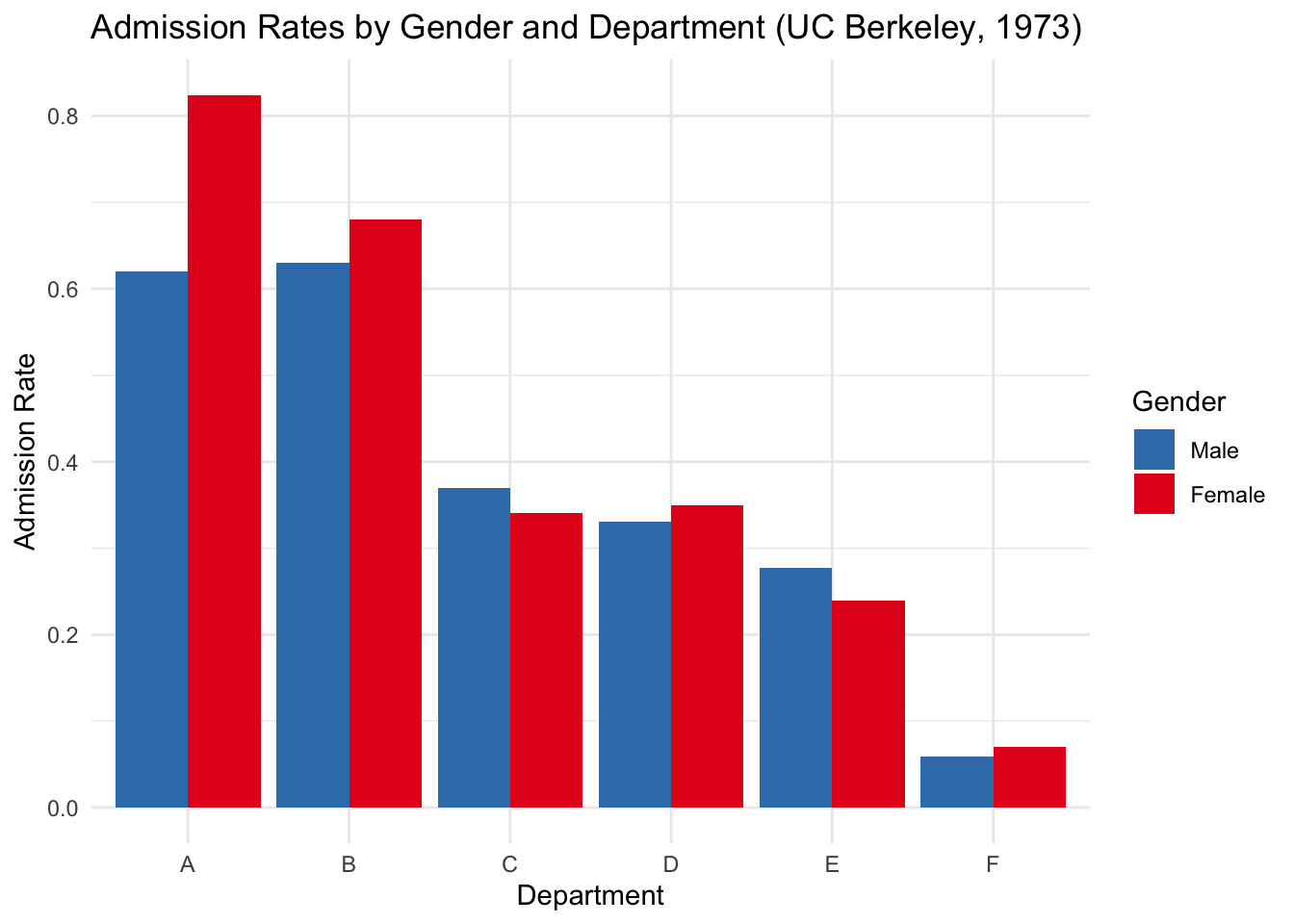
1 A Male 512 313 825 0.621
2 A Female 89 19 108 0.824
3 B Male 353 207 560 0.630
4 B Female 17 8 25 0.68
5 C Male 120 205 325 0.369
6 C Female 202 391 593 0.341
7 D Male 138 279 417 0.331
8 D Female 131 244 375 0.349
9 E Male 53 138 191 0.277
10 E Female 94 299 393 0.239
11 F Male 22 351 373 0.0590
12 F Female 24 317 341 0.0704
One of the following statements best describes the core difference between dept_admit and overall_admit. Pick the most appropriate:
Now the story flips: in most departments, women have higher admission rates than men. So how can the overall numbers suggest the opposite? This reversal is a textbook example of Simpson’s Paradox - a phenomenon where a trend appears in different groups but reverses when the groups are combined.
In this case, women were more likely to apply to departments with lower overall admission rates (e.g., departments C, D, E, F), while men applied more to departments with higher admission rates (departments A and B). The aggregate numbers hide this because they mix different denominators across departments.
This illustrates a broader lesson: data summaries without disaggregation can obscure the underlying structure of your data. And without visualization, this kind of paradox is hard to detect.
Let’s visualize the department-level admission rates by gender.
ggplot(dept_admit, aes(x = Dept, y = AdmitRate, fill = Gender)) +geom_col(position ="dodge") +labs(title ="Admission Rates by Gender and Department (UC Berkeley, 1973)",y ="Admission Rate", x ="Department") +scale_fill_manual(values =c("Male"="#377eb8", "Female"="#e41a1c")) +theme_minimal()
Which of the following charts best describes the chart displayed above?
What do the letters x and y refer to, in statistical terms?
Which of the following might best describe why we have put AdmitRate as the Y variable in this chart?
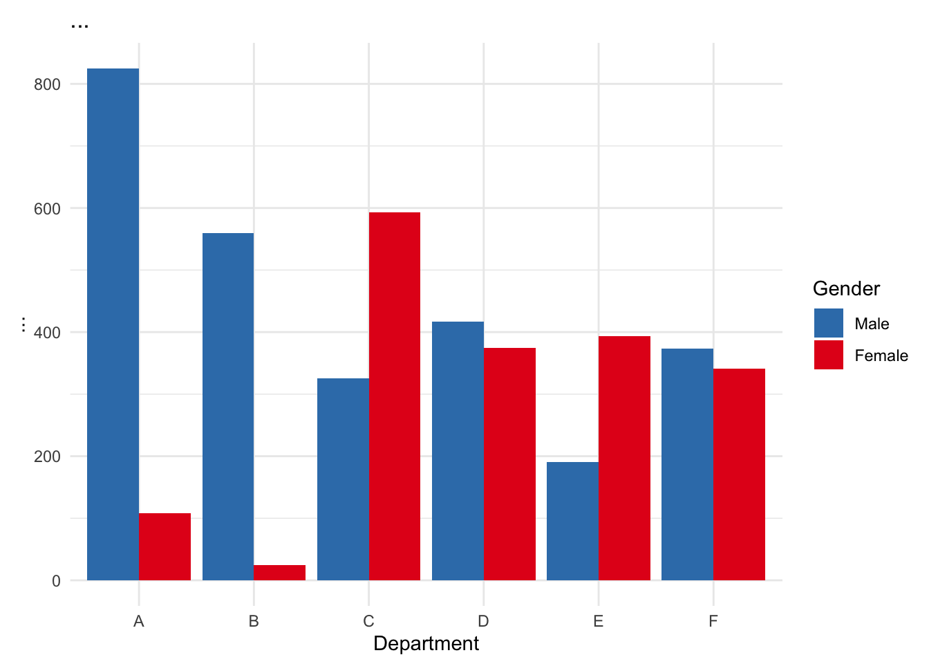
This plot shows that in nearly all departments, women had similar or higher admission rates than men. The illusion of bias in the aggregate comes from differences in application patterns, not unfair decisions within departments. To confirm this, let’s also show how department choice varied by gender.
`summarise()` has grouped output by 'Dept'. You can override using the
`.groups` argument.
ggplot(applicants, aes(x = Dept, y = Applicants, fill = Gender)) +geom_col(position ="dodge") +labs(title ="...",y ="...", x ="Department") +scale_fill_manual(values =c("Male"="#377eb8", "Female"="#e41a1c")) +theme_minimal()
This second chart reveals that men were more likely to apply to departments A and B, which had higher acceptance rates, while women applied more often to departments C through F, where competition was steeper.
What is the core difference between the two charts presented above?
Wrapping Up
This example is more than a historical curiosity—it’s a powerful reminder of what can go wrong when we skip visual exploration. Without breaking down the data into meaningful subgroups or visualizing it, we risk drawing misleading conclusions from aggregated numbers—a mistake that can easily obscure important patterns or biases hidden within the data. Here are a few key takeaways:
Never Rely on Aggregates Alone Always ask: What groups might I be collapsing? Can different subgroups tell different stories?
Use the Right Visualization for the Question Tables are great for precision, but bar plots, dot plots, and faceted graphics help reveal structure. In this case, side-by-side bar charts made the paradox visible in seconds.
Visuals Help You Understand Your Own Data Good graphics aren’t just for presentations. They’re how you, as a researcher or analyst, come to understand the texture of the data you’re working with.
Tabulation Has Added Value When It Reveals Structure A well-designed cross-tab or grouped summary tells you what’s driving a result. Don’t just count things—count them strategically.
Hungry For More?
For more information on the exact data used in this post, check out the full paper here. Alternatively, type help(UCBAdmissions) into the R console if you wish to replicate or extend the analyses conducted here.